Monday, January 30, 2006

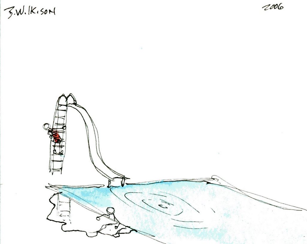
I DON'T EVEN KNOW WHAT TO CALL THIS (PART II)

When it all starts to take shape, there is little that can pull you away from the piece!

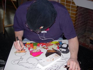
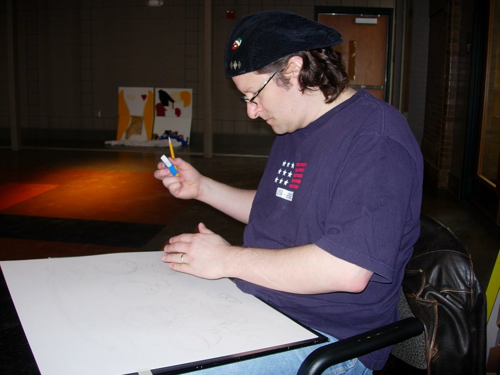
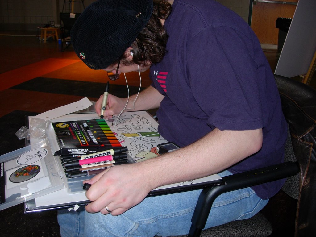
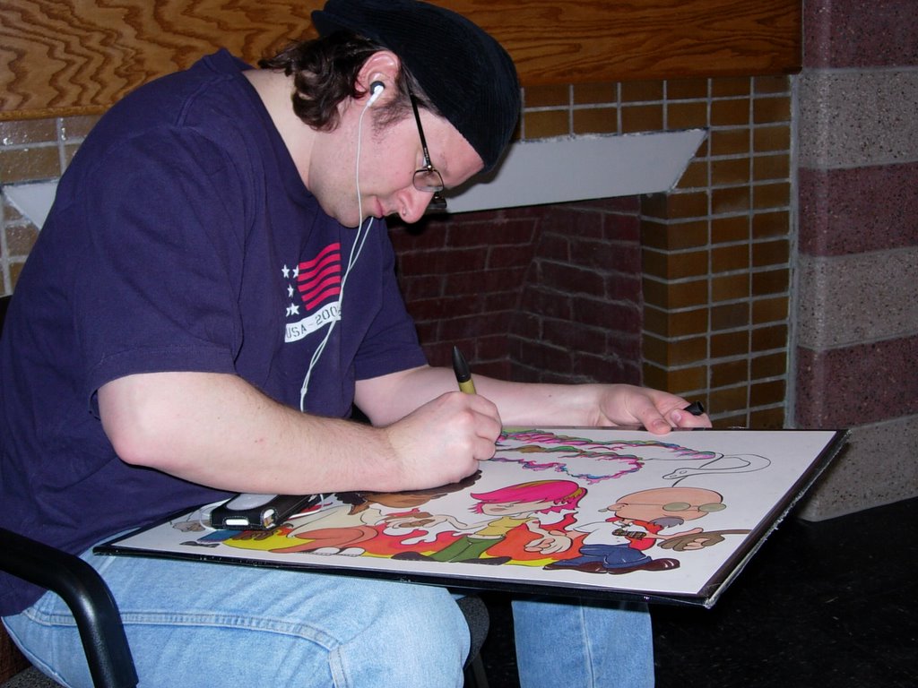
Once I begin layering on the colour, the piece begins to take on a life of it's own. My only hope at this point is that I don't let my creativity get too far off track. Many things begin to run through your thoughts. Some of which have absolutely nothing to do with the piece. Some say that this is when you are in "the zone."


I say it is the point when the markers go to my head. I realize after finishing this piece in about 6 hours (in an open space) that I still need to invest in a small, personal size, table fan. The headache I developed on this one is not something I wish to repeat.


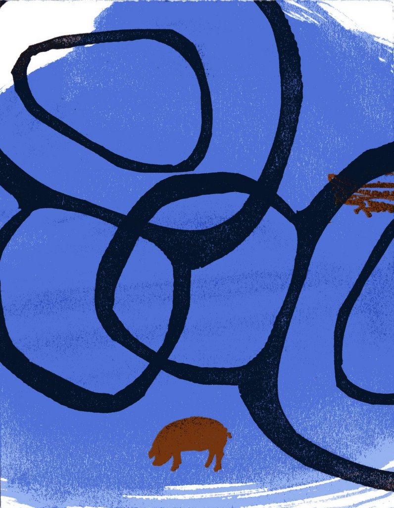
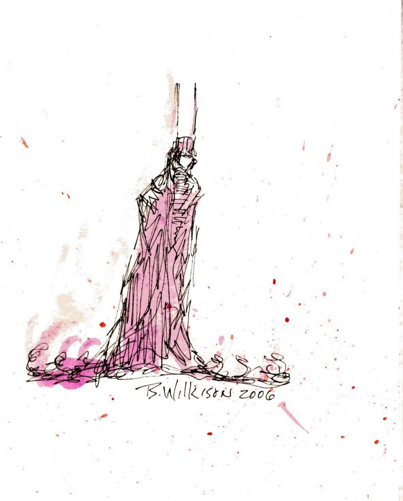
The "melting pot" idea came to me on the way to the event. I didn't know what kind of pot, but on the page I decided that a two handled stockpot would do the trick. The boiling over came out quit nice and I just let my hand do what it needed to do. Not much control. Just let my creativity bubble over, as it were. Sometimes (most times) art needs that freedom. I think the skill really kicks in when you can take those rough sketches and let the image emerge. You really don't have to force it, just let the ink sit on top of the pencils, finding it's own position of comfort. Look at people as they lay on a sofa or sit with a leg over the arm of a chair. It may not be the way the furniture was intended to be used, but as long as it looks comfortable and not forced, then, well...as Dorian Clevenger once told me, "If it looks right, it is right."


Seriously, skill and influence really come into play here. You think of your heros, those who inspire you. The "bubble, bubble, toil and trouble" of it all came from influences of Big Daddy Roth and Stephen Blickenstaff. The colour choice here was directly impacted by my fascination with psychedelic art. Griffin, Mouse, Arminski, Thomas! All influences that unwittingly find their way into my work.

Then there comes a time when, in my opinion, the magic happens. That one addition that makes it's way to the page at the very end. The final brush stroke if you will, it may have been germinating since the piece began, but when you step aside and actually see it there before your very eyes (before you have even committed it to the page). And you "know" it's right. The final steps are like that of a child. Not broken and uncertain, but gleefully reckless!!! Like a child, like a child. The flag was there, so I let it fly.

This piece will be on display through July at the Garfield Park Arts Center in Indianapolis Indiana. There are some terrific works by other artists there as well. If you have an opportunity to do so, please stop by. As for "Melting Pot", some are amazed that it is all done in marker. Some think I'm crazy for not just colouring these pieces on the computer. But, that's not art. It's not! You are! Use you whenever possible.
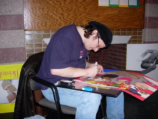
Monday, January 23, 2006

I DON'T EVEN KNOW WHAT TO CALL THIS (PART I)

Art provides an experience. Those that do not take advantage of that experience have no right to call themselves artists.


Pretty bold statement, I know. I had no idea what I was getting myself into when I signed on to be a part of an all day art jam this weekend at Garfield Park. It was actually a two day event, but I draw pretty quick and I could only attend one day. All you had to do was to create a piece of art on site at the Arts Center. The purpose of the Creative Native Art Competition is to engage the visual arts community in the creation of their individual "Masterworks" in various mediums. The only "rule" was that the art be based on one of the following themes: The Arts, Diversity, Garfield Park. Before I reveal the theme I chose, I thought I might take you through a step by step of my creative process. As you can see in the first photo, much of the process involves erasing.


Seriously, though...I never really put pencil to paper without an idea in my head. When I started drawing as a kid I could never get the picture I was drawing to look like the picture in my head. I finally figured out that I had to make the picture in my head look like the picture I could draw. That to me is how you develop your style. It's a hole horse before the cart thing.


I decided the night before to "go with what I know". ROCKHEADS! I had to work with their poses a bit. The images in my head are animated and it is difficult for me to view the images stationary. I think that accounts for something in my art, but I have yet to define what "that" is. The other difficulty I had was making sure I got the hand positions right. For some reason I need to see the intricacies of two hands entwined. It's a beautiful thing and since I am self taught, I don't have the understanding of anatomy that some artisits do.


I love that feeling when I've gotten the pencils to a point that I can begin to ink them. That first line of thick, wet, black ink is exhilarating. I start with the lines that will be filled in with black. The first lines are always the roughest in my opinion. I'll talk more about "the freedom of the ink" a bit later.


One of the most exciting parts of the process for me is "the discovery." I keep my pencils very light and very loose. I will often put down the brush to add a line here or a line there. I know it sounds cliche, but the piece does begin to speak to you. You've got to go with it! That's why we have erasers. Actually this happened twice. The background came to me in a flash...more on that later.


Once I've slung all the ink onto the canvas, it's time to color. I taught myself to draw with charcoal, so my work never had colour for a few years. But, thanks to many fellow artists that saw that early work, they encouraged me to work in colour. I hope if they ever get a chance to see my work that they are happy with the results. The ROCKHEADS! by nature are intended to be coloured in marker. I wanted to capture the feel of all those book covers I drew on in grade school. I tend to favor Sharpies. If I can do a piece entirely of Sharpies, I will. Tria Markers provide a shocking array of colour that cannot be denied though. I will use Prismacolor, but hope to weed them out eventually, they just dry up too quickly and just aren't worth the trouble to drain every last drop out of them.


At this point is when I really start getting into the zone! (But, remember, I'm working in very close proximity to markers!) We're about halfway through, so, it's time to take a break...tune in next week as we go deep inside The Inkslinger's mind and I reveal the last stages of my "Masterwork."


This is another dude that was there. I'm not sure what he's doing, but I'm pretty sure he shouldn't be smoking a cigarette while he's doing it!

Thursday, January 19, 2006

Pressing matters!

That's right! The ol' inkslinger has taken his first steps into the relm of self printing. My friend and associate Josh Johnson (a master ink slinger in his own right) let me play around with his letter press the other day. Josh, as always, was a generous and delightful host, who wanted to make the experience as fun and pleasant as possible. He taught himself on the ol' letter press, so I was able to learn from his mistakes, from the setting to the mixing of ink right down to striking the image. But, when it came time to clean the thing, most artists would have run for cover (or at least more coffee. Not me! I was in there takin' care of business. I by no means wish to claim any expertise, but at least I now know a little bit more about how it works.

Josh promised me another rideon the press, so, if you're lucky you might get a Valentine card....cut, inked and pressed by yours truly!
©2006 Josh Johnson/B. Wilkison

Friday, January 13, 2006

A Rick Griffin thing...


It's really just a Rick Griffin sort of thing. It's called Marybeth for a reason. Figure it out! Actually I got talking to Doug Klauba Sr. who, back in the day, did pin stripping. It's a lost art and I hope someday I have the opportunity to learn a little of this incredible art form from him. The art form has come a long way, but you just can't beat a straight line. If you have no idea what I'm talking about, it just goes to prove my point. All that pin stripping you saw in the 50's and 60's, that was done by hand (no decals), and until you've seen a dude walk down the side of a '57 with a paintbrush and an attitude, you really haven't seen much.


This is my most recent. It's called Amy. I know you can figure this out. Anyway I like having to figure these out and at some point they just start to flow, like all art should.

Friday, January 06, 2006

Mailable Art

Well, I thought I'd follow up with a second round of "mailable art." It's really a trip and the outcome is quite surprising even to me. It's all about imagery and letting go, trying not to control the image, but slinging the ink and letting it fall where it may. This style is more like my thumbnail sketches, but they are more committed as I draw them straight to ink!


The first is simply called "Bird House". There is no background and no perspective but somehow the scanned image seems to jump off the page. I'm not sure if that is because of the colours or the optical illusion created by the horizontal and vertical lines coming together. Or if it is just that fascinating way computers sometimes WILL make an image look better.


The next is "Catbone". Simply put it's just two images that you would not normally see together. When I stepped back to look at it I could hear that familiar riff by George Thorogood and the Destroyers...b, b, b, b, b, bad to the bone!


Which came first, the camera or the cheese? Well, in any event I sent this one to my favorite photographer of all time, Beatrice Neumann. You can and should visit her at http://www.photokat.com. Tell her I said, "Hello!"


And then we come to one of my personal favorites. These "full-figured" stick figures really don't get enough play time with me so I decided to feature them in a few this round. What I love about this one is that the slide started out to be a normal park slide. But, it just didn't look right. As soon as I added the swimming pool it seemed to fit. Well, I always like to show some action or at least the "evidence" of some action in my illustrations, hence the ripples. I can't remember what happened next but I made an accidental mark on the card. That mark became the reflection of the ladder in the pool of water on the side of the pool. Why I felt I needed a witness to all this in a red bathing suit is beyond me! But, what I absolutely love is that the first person to lay eyes on this said, "He did a cannonball!" Who knew?!


Remember, my work is best viewed at a distance while squinting.

Tuesday, January 03, 2006

First inks of 2006!

I didn't waste anytime inking for the year 2000 and 6! I created 20 "mailable art" cards for friends. Maybe you were one of them?! If not, fear not! I'd be happy to add you to my list of victims. Just contact me at http://homepage.mac.com/bwilkison. I will not sell your address to any third parties. However, I may lose it...so, keep those cards and letters coming! You have to send mail to get mail!


The first one is "The Bat." Which is basically an illustrators generic name for any drawings of Batman™ without having to deal with all the legal mumbo jumbo. I love the character of Batman™ because it is really one of the most perfect images ever created. Anybody can draw him. You can throw down any ol' crappy drawing of Batman™ and people are going to know who it is.


The second one is "Buddha Balloon." It turned out so good I decided to do another called "Christ Kite." That one didn't go over so well. But, similar to "The Bat", you don't even have to see the drawing "Christ Kite" to know exactly what it looks like!
All 20 images were then colour slung with school approved washable watercolors (none of that fancy expensive stuff for me.)

Well, I hope I didn't get any on ya!